
- Moving the markets
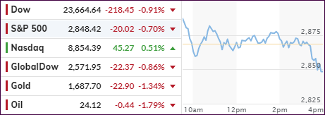
It was a tug-of-war throughout the session, as an early rally died on the vine with two of the three major indexes diving into the red during the last 30 minutes. The exception was the Nasdaq, which managed to stay above the unchanged line but had to give up more than 50% of its early gains.
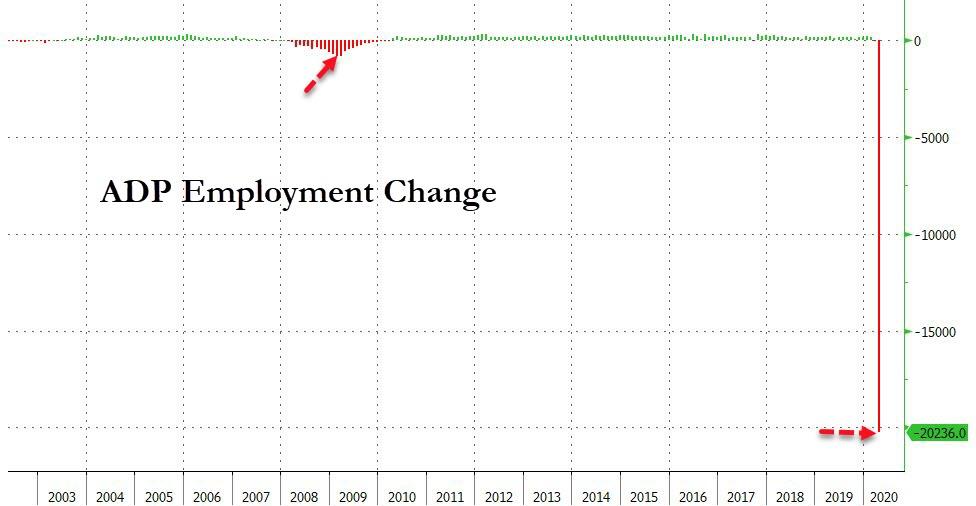
Amazingly, the markets were able to overcome ADP’s report of a loss of over 20 million private sector jobs in April, a number that is unprecedented. Bloomberg demonstrates in this sobering chart how this figure compares to history. It does not. This is mindboggling when considering that during the Great Financial Crises, some 10 years ago, the largest monthly job loss was “only” 834,700!
In the end, this reality check was too great to overcome causing the sell-off with nervousness spreading in anticipation of tomorrow’s weekly jobless claims data and Friday’s monthly nonfarm payrolls and unemployment report.
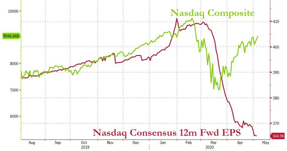
You have to laugh at the performance of the Nasdaq, which continues to rally in the face of collapsing earnings, thereby presenting a picture that is clearly distorted to say the least. This disconnect between markets and data is now the largest on record.
This abnormality is not exclusive to the Nasdaq, many major indexes are sporting the same kind of divergence, as Goldman Sachs points to in this chart.
According to Nomura’s McElligott the rally is now done, at least for the next few months, and as the Nomura strategist writes, “his sense is ‘lower’ for the next move across the Summer months, as I think the market’s current pragmatism towards the virus in conjunction with the “feel-good” of the rally leaving it exposed to the downside of a coming second-wave as cases, as restrictions ease and some States rush back to “normalcy”…yet with fewer Fed and fiscal bullets in the chamber next time around.”
While that is only one man’s opinion, I believe caution is still warranted until that moment in time when our Trend Tracking Indexes (TTIs) show enough upward momentum to generate a new “Buy” signal.
2. ETFs in the Spotlight
In case you missed the announcement and description of this section, you can read it here again.
It features some of the 10 broadly diversified domestic and sector ETFs from my HighVolume list as posted every Saturday. Furthermore, they are screened for the lowest MaxDD% number meaning they have been showing better resistance to temporary sell offs than all others over the past year.
The below table simply demonstrates the magnitude with which these ETFs are fluctuating above or below their respective individual trend lines (%+/-M/A). A break below, represented by a negative number, shows weakness, while a break above, represented by a positive percentage, shows strength.
For hundreds of ETF choices, be sure to reference Thursday’s StatSheet.
For this past domestic “Buy” cycle, which ended on 2/27/2020, here’s how some our candidates have fared:
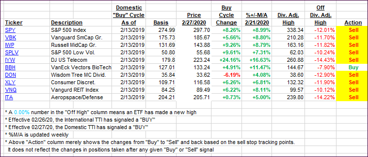
Click image to enlarge
Again, the %+/-M/A column above shows the position of the various ETFs in relation to their respective long-term trend lines, while the trailing sell stops are being tracked in the “Off High” column. The “Action” column will signal a “Sell” once the -8% point has been taken out in the “Off High” column. For more volatile sector ETFs, the trigger point is -10%.
3. Trend Tracking Indexes (TTIs)
Our TTIs headed south as the markets dumped into the close.
This is how we closed 05/06/2020:
Domestic TTI: -12.47% below its M/A (prior close -11.19%)—Sell signal effective 02/27/2020
International TTI: -13.73% below its M/A (prior close -12.98%)—Sell signal effective 02/26/2020
Disclosure: I am obliged to inform you that I, as well as my advisory clients, own some of the ETFs listed in the above table. Furthermore, they do not represent a specific investment recommendation for you, they merely show which ETFs from the universe I track are falling within the specified guidelines.
Contact Ulli