
- Moving the markets
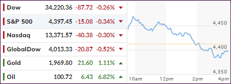
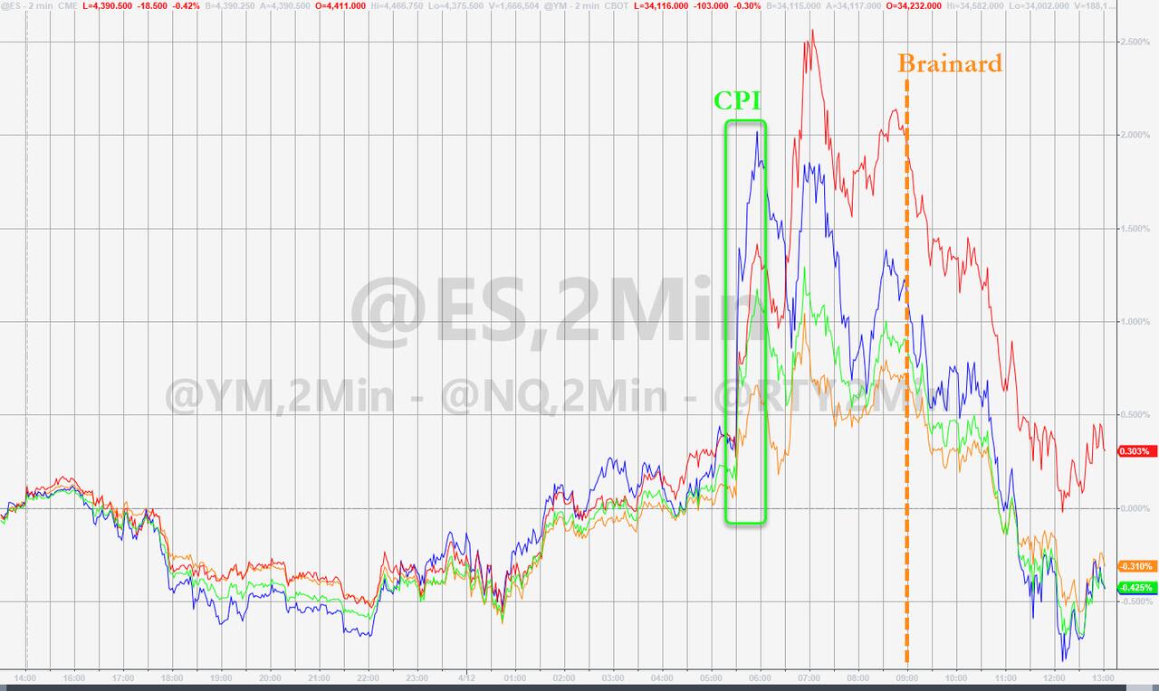
Despite the CPI coming in at an annual rate of 8.5%, worse than expected (8.4%), the fact that the index increased a horrible 1.2% MoM was simply ignored, as traders, and computer algos were encouraged by the Core CPI (excluding food and energy), which “only” rose 0.3% in March vs. an expected gain of 0.5%.
That got the bullish juices flowing, and up we went with the Dow at one point being in the plus by over 250 points. However, there was not much conviction behind the move, especially after the Fed’s Lael Brainard confirmed her hawkishness, as ZH noted:
The Fed will move “expeditiously” to raise interest rates and return surging inflation to its 2% target, and that a decision on the balance sheet “could be as soon as May, which would lead to reductions in that balance sheet starting in June.”
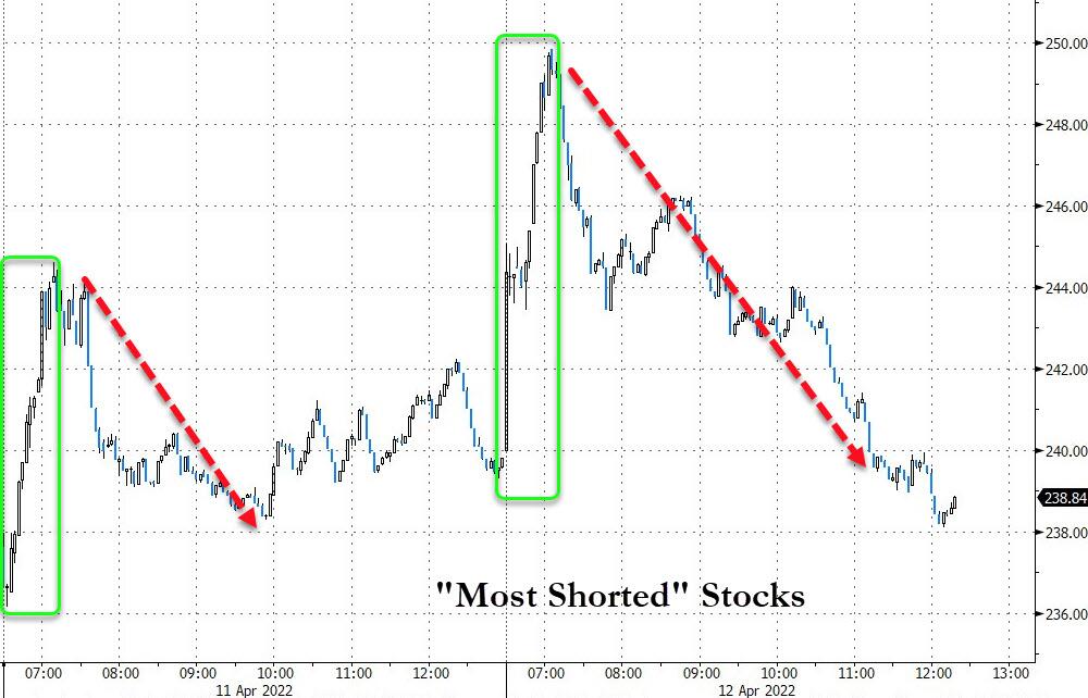
That reversed the early optimism, and down we went with all 3 major indexes diving into the red, giving the bears something to cheer about. An early assist came from a short squeeze, but that attempt died on the vine.
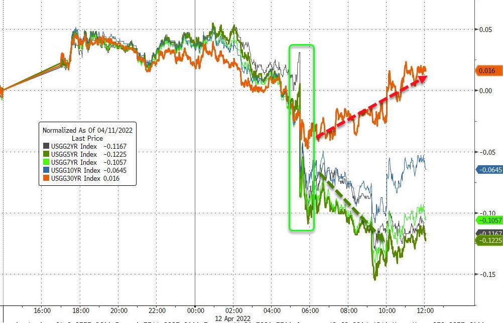
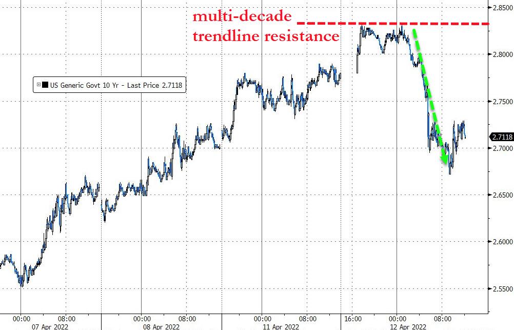
After setting early intra-day highs, bond yields slipped with the 10-year closing at 2.725%, which was quite a drop after having touched its multi-decade downtrend resistance level of 2.83%, as ZH pointed out.
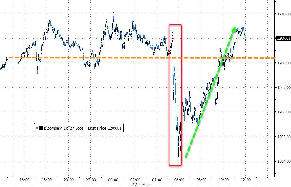
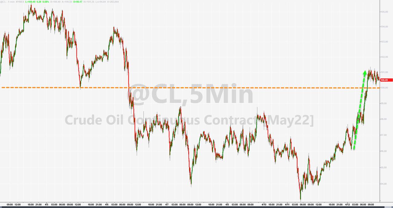
The US Dollar dumped and pumped and closed moderately higher. The energy sector ripped higher (VDE +1.67%) with Crude Oil back over $100 and the commodity index DBC gaining +2.96%.
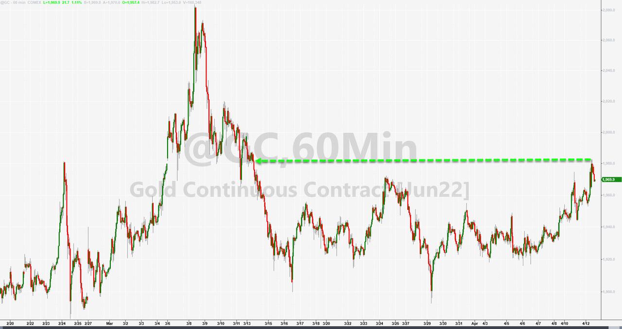
Gold danced to the beat of its own drummer by ignoring the dollar’s comeback and gained a solid +1.14% for the day, thereby again approaching its $2k level.
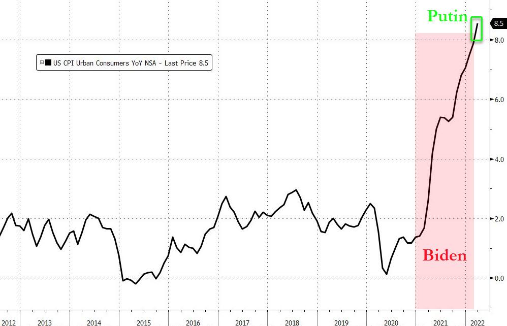
Mainstream media has been focusing on who to blame for this inflationary environment with the fingers pointing to “Putin-flation,” an accusation that this chart by Bloomberg disputes.
Yes, a picture is truly worth a thousand words.
2. ETFs in the Spotlight
In case you missed the announcement and description of this section, you can read it here again.
It features some of the 10 broadly diversified domestic and sector ETFs from my HighVolume list as posted every Saturday. Furthermore, they are screened for the lowest MaxDD% number meaning they have been showing better resistance to temporary sell offs than all others over the past year.
The below table simply demonstrates the magnitude with which these ETFs are fluctuating above or below their respective individual trend lines (%+/-M/A). A break below, represented by a negative number, shows weakness, while a break above, represented by a positive percentage, shows strength.
For hundreds of ETF choices, be sure to reference Thursday’s StatSheet.
For this just closed-out domestic “Buy” cycle, here’s how some of our candidates have fared:
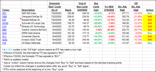
Click image to enlarge.
Again, the %+/-M/A column above shows the position of the various ETFs in relation to their respective long-term trend lines, while the trailing sell stops are being tracked in the “Off High” column. The “Action” column will signal a “Sell” once the -12% point has been taken out in the “Off High” column, which has replaced the prior -8% to -10% limits.
3. Trend Tracking Indexes (TTIs)
Our Domestic TTI broke below its trend line and into bearish territory. It barely slipped into the red, confirming our current bearish stance towards equities. However, in this tumultuous environment, things can turn on a moments notice.
Right now, I will stick to my view that only limited exposure to domestic equities is warranted, and selective sector funds (gold, commodities, and energy) are the main areas to be invested in.
This is how we closed 04/12/2022:
Domestic TTI: -0.09% below its M/A (prior close +0.25%)—Sell signal effective 02/24/2022.
International TTI: -1.30% below its M/A (prior close -0.81%)—Sell signal effective 03/08/2022.
Disclosure: I am obliged to inform you that I, as well as my advisory clients, own some of the ETFs listed in the above table. Furthermore, they do not represent a specific investment recommendation for you, they merely show which ETFs from the universe I track are falling within the specified guidelines.
All linked charts above are courtesy of Bloomberg via ZeroHedge.
Contact Ulli