In another repeat performance, the market pullback continued during the past week and affected all of our portfolios.
There were a few surprises. Our Trend Tracking Portfolio (#1) not only held up the best, it actually gained in the face of the selloff. This was followed closely by a lesser gain of the Aggressive Portfolio (#3), which now holds the 2nd place on a YTD basis. The largest loss occurred in the income portfolio (#5) which, however, is still hanging on to the #1 position.
No trailing sell stops were triggered, although 2 positions (EPP and VEU) briefly dropped below their respective trigger points on Tuesday, but closed back above as of today.
When markets sell off, as they have been for the past few weeks, you need to observe the effect on the various portfolios, in order to evaluate which one you are most comfortable with. It’s easy to like a well performing portfolio in a bull market, but can you live with it when the bear rears its ugly head?
Let’s look at the portfolios in order:
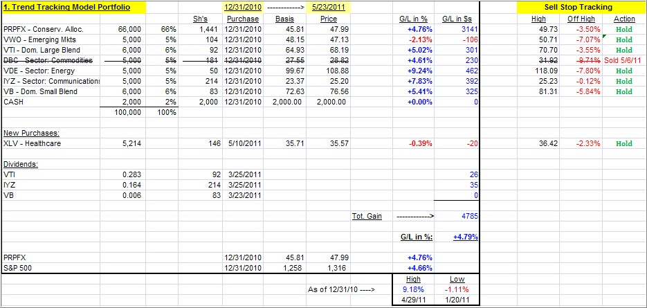
1. ETF Trend Tracking Model Portfolio
This is the portfolio allocation I predominantly use in my advisor practice. Given current market conditions, and an ever growing number of global hotspots, I like the concept of having a solid core holding in PRPFX, although with the recent slide in metals, it has slipped as well but recovered nicely during the past week.
Around this fund, I have added what I call boost components consisting of ETFs that can produce higher returns than my core holding, at least during bullish periods. When a market pullback occurs, the core holding should add an element of stability.
This is exactly what happened early in March 11, when the double natural disasters struck Japan. While the S&P 500 lost all of its YTD gains, and dropped into negative territory, this portfolio stayed positive.
Nevertheless, as you know from my writings, anything I invest in involves the use of trailing sell stops, which are shown and tracked on the upper right of the table.
Last week, this portfolio was up YTD +4.31% vs. +4.79% as of today.
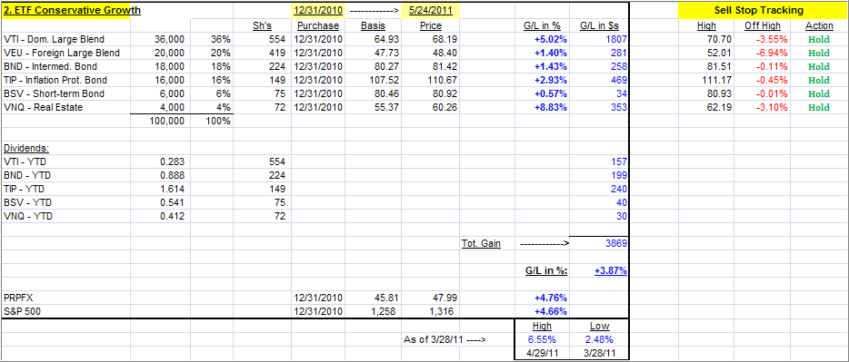
2. Conservative ETF Growth Portfolio
This portfolio, as are the following ones, would be typical of what is being used in the buy-and-hold community, as you can see by the 40% allocation to various bond ETFs. If you are conservative, this simple combination could work for you, but I still recommend the use of the trailing sell stops during these uncertain times.
Last week, this portfolio was up YTD +4.26% vs. +3.87% as of today.
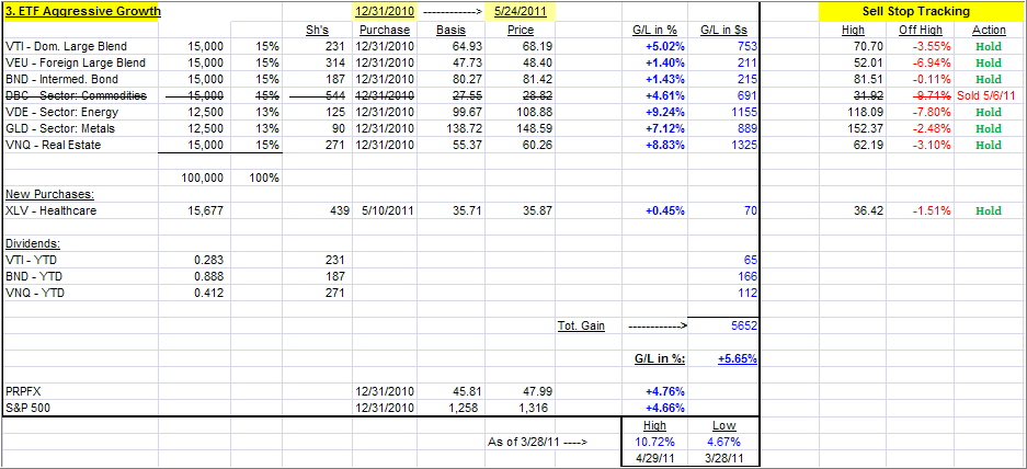
3. Aggressive ETF Growth Portfolio
What makes this one aggressive is the small 15% allocation to bonds. This portfolio was leading the bunch on a YTD basis, but with the recent correction, it came off its high very quickly.
However, if you have an aggressive streak in your personality, you could consider this one. If you use my recommended sell stop discipline, you know exactly ahead of time what your risk will be.
Last week, this portfolio was up YTD +5.46% vs. +5.65% as of today.
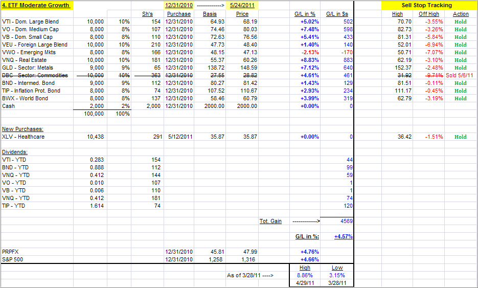
4. Moderate ETF Growth Portfolio
I call this one moderate growth, because of the higher allocation to various bond ETFs (26%) than in the aggressive set up above. It is also more diversfied domestically, but as the YTD return shows, that does not seem to matter much as it is pretty even with my Trend Tracking Portfolio.
Last week, this portfolio was up YTD +4.76% vs. +4.57% as of today.
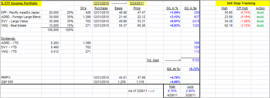
5. ETF Income Portfolio
This is as simple as it gets, but even in the current market environement, this portfolio still ranks #1. During the recent sell-off, it dropped in value quickly due to no offsetting bond positions but still has kept its grip on the top spot YTD. Be sure to use a 7% sell stop on all holdings.
Last week, this portfolio was up YTD +6.99% vs. +5.72% as of today.
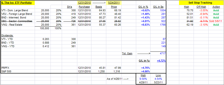
6. The Ivy ETF Portfolio
If you missed the recent post about the Ivy portfolio, you can read it here.
This is a simple 5-asset class portfolio with each individual component being bought when it crosses its respective trendline to the upside. Each component is being sold once it crosses its trend lines to the downside again, according to the author’s rules.
I have made 3 adjustments:
1. I apply a 39-week Simple Moving Average (SMA) to generate the Buys, while the authors use a 45-week SMA.
2. As mentioned in the blog post, I prefer using my trailing sell stop discipline for my exit strategy.
3. Personally. I favor using BND (as opposed to IEF) as my bond component, since it has shown more stabilty in the past.
This portfolio was also affected by the sale of DBC. I will re-enter this position once it has taken out its old high of 31.92 to be sure that any rebound is not just another headfake.
Last week, the Ivy portfolio was up YTD +5.26% vs. +4.72% as of today.
To repeat, the key to selecting a portfolio from the above list is not just performance. Personally, I’d rather lag a little on the upside but have some assurance that I will also lag when the downside comes into play.
This will help you to sidestep whipsaw signals on occasion, which are caused by temporary market pullbacks followed by a subsequent resumption of the previous up trend.
I will update these portfolios every Wednesday and inform you via email that the updated versions have been posted.
Quick Reference:
Contact Ulli
Comments 4
Are your model portfolios actual money invested or theoretical exercises?
Ed,
As I said, the #1 portfolio is the one that I use predominantly in my advisor practice. The others are presented for readers to assist them in making better choices when setting up their own portfolios.
Ulli…
Do you have tested the IVY portfolio for the previus years?
Can you Publish such performance?
Thanks for your wonderful work.
Giorgio,
Yes, it was tested and reviewed here:
https://theetfbully.com/2011/05/testing-the-ivy-etf-portfolio/
If this interests you, you should buy the book at Amazon.
Ulli…