
- Moving the markets
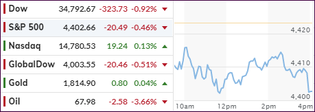
A variety of factors combined to knock down equities with the 10-year bond yield getting whacked around like a rubber ball in a trampoline factory.
First, General Motors dropped some 7%, which weighed heavily on the broad market as the automaker missed earnings expectations, but it managed to issue a positive guidance for the remainder of the year.
Second, in economic news, the private ADP payroll survey confirmed a weakening environment with a meager gain of only 330k jobs for July vs. expectations of 653k. This could be a harbinger of things to come when the Labor Department’s official jobs report will be posted on Friday. However, at times, one report is not indicative of the other.
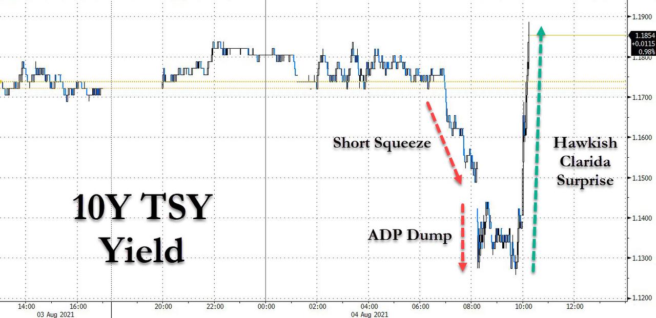
Third, an early short squeeze in the bond market set up a negative tone with the 10-year yield dipping to below 1.13%, after which all hell broke loose. The cause was remarks from Fed Vice Chair Richard Clarida opining that “the Fed may be much closer to tightening than last week’s FOMC release implied.”
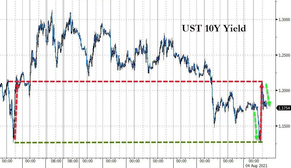
Ouch, no one saw that one coming and bond yields responded to that much hawkishness by spiking straight up to almost 1.19% before easing back to 1.16%, as this chart shows.
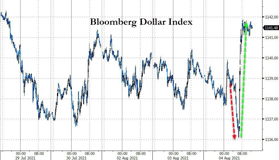
The US Dollar index first dumped to 6-week lows and then pumped on Clarida’s hawkish remarks. Gold followed suit and rode its own rollercoaster and ended up slightly in the green. Despite this wild ride, the losses for the major indexes were moderate with the Nasdaq escaping unscathed.
Observing equity reaction to even the slightest hint of rising bond yields just goes to show the market’s total dependence on low rates/yields. Unfortunately, yields will have to go up at some point, as rising rates will be the only tool available to deal with the ever-increasing inflationary threat.
If you were around in 1980, you’ll recall that this is how then Fed Chairman Volker reigned in the crisis. And no, this time will not be different.
2. ETFs in the Spotlight
In case you missed the announcement and description of this section, you can read it here again.
It features some of the 10 broadly diversified domestic and sector ETFs from my HighVolume list as posted every Saturday. Furthermore, they are screened for the lowest MaxDD% number meaning they have been showing better resistance to temporary sell offs than all others over the past year.
The below table simply demonstrates the magnitude with which these ETFs are fluctuating above or below their respective individual trend lines (%+/-M/A). A break below, represented by a negative number, shows weakness, while a break above, represented by a positive percentage, shows strength.
For hundreds of ETF choices, be sure to reference Thursday’s StatSheet.
For this current domestic “Buy” cycle, here’s how some our candidates have fared:
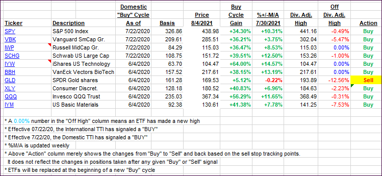
Click image to enlarge.
Again, the %+/-M/A column above shows the position of the various ETFs in relation to their respective long-term trend lines, while the trailing sell stops are being tracked in the “Off High” column. The “Action” column will signal a “Sell” once the -8% point has been taken out in the “Off High” column. For more volatile sector ETFs, the trigger point is -10%.
3. Trend Tracking Indexes (TTIs)
Our TTIs reversed and gave back yesterdays’ advances.
This is how we closed 08/04/2021:
Domestic TTI: +10.01% above its M/A (prior close +11.06%)—Buy signal effective 07/22/2020.
International TTI: +6.66% above its M/A (prior close +7.24%)—Buy signals effective 07/22/2020.
Disclosure: I am obliged to inform you that I, as well as my advisory clients, own some of the ETFs listed in the above table. Furthermore, they do not represent a specific investment recommendation for you, they merely show which ETFs from the universe I track are falling within the specified guidelines.
All linked charts above are courtesy of Bloomberg via ZeroHedge.
Contact Ulli