- Moving the markets
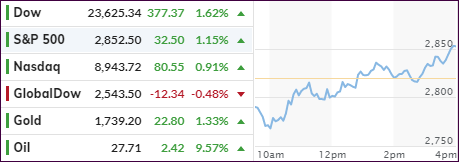
The Dow managed to recover from a sharp opening tumble of some 400 points to reverse and close higher by 377 points, which makes this an intra-day range of almost 800 points. The other two major indexes followed a similar pattern but lagged in magnitude and performance.
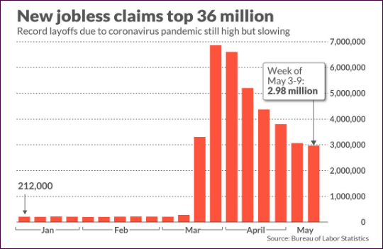
That means we’re back to where any news is good news, even as another 3 million people applied for unemployment last week bringing the total jobless claims to over 36 million while, during the same time period, the Nasdaq is up over 30%.

Apparently, the claims are slowing, which was enough to shift the computer algos into high gear thereby wiping out some of the sharp losses sustained over the last couple of days.
According to MarketWatch, the unemployment rate has likely reached 20% officially, government data suggest, and it’s likely to rise again in May, as many states are trying to reignite their economies, but so far it’s been a slow process.
None of the above matter, because the higher the jobless count, the better the stock indexes perform, or so it seems.
ZH summed it up like this:
This is the 7th week of the last 8 with massive job losses and gains for The Dow…
3/26 – 3.31mm jobless, S&P +6.24%, Dow +6.38%
4/02 – 6.87mm jobless, S&P +2.28%, Dow +2.24%
4/09 – 6.62mm jobless, S&P +1.45%, Dow +1.21%
4/16 – 5.24mm jobless, S&P +0.58%, Dow +0.12%
4/23 – 4.43mm jobless, S&P -0.04%, Dow +0.18%
4/30 – 3.84mm jobless, S&P -0.92%, Dow -1.17%
5/07 – 3.17mm jobless, S&P +1.15%, Dow +0.89%
5/14 – 2.98mm jobless, S&P +1.15%, Dow +1.62%
Helping the bullish theme was, after a two-day absence, a short squeeze, which some analysts claim was the entire force behind today’s run up.
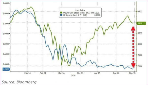
Throwing some water on today’s fiery move was the Fed’s Kashkari, who opined that he had “more confidence in the signal from the bond market than the stock market,” which prompted ZH to add “equity bulls better hope he’s wrong…”
This chart makes that abundantly clear:

The divergence between stocks and bonds is as wide as ever, which makes me ponder: Who will eventually be right?
2. ETFs in the Spotlight
In case you missed the announcement and description of this section, you can read it here again.
It features some of the 10 broadly diversified domestic and sector ETFs from my HighVolume list as posted every Saturday. Furthermore, they are screened for the lowest MaxDD% number meaning they have been showing better resistance to temporary sell offs than all others over the past year.
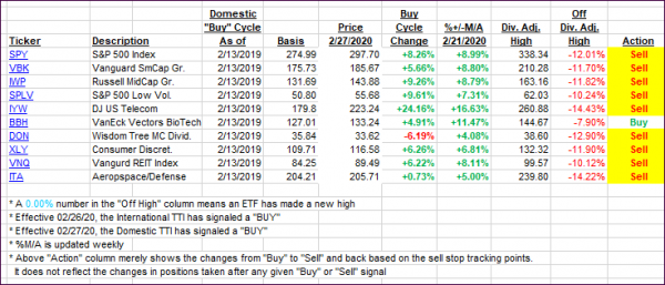
The below table simply demonstrates the magnitude with which these ETFs are fluctuating above or below their respective individual trend lines (%+/-M/A). A break below, represented by a negative number, shows weakness, while a break above, represented by a positive percentage, shows strength.
For hundreds of ETF choices, be sure to reference Thursday’s StatSheet.
For this past domestic “Buy” cycle, which ended on 2/27/2020, here’s how some our candidates have fared:

Click image to enlarge
Again, the %+/-M/A column above shows the position of the various ETFs in relation to their respective long-term trend lines, while the trailing sell stops are being tracked in the “Off High” column. The “Action” column will signal a “Sell” once the -8% point has been taken out in the “Off High” column. For more volatile sector ETFs, the trigger point is -10%.
3. Trend Tracking Indexes (TTIs)
Our TTIs gave us a mixed picture with the Domestic one improving and the International one worsening.
This is how we closed 05/14/2020:
Domestic TTI: -13.00% below its M/A (prior close -14.33%)—Sell signal effective 02/27/2020
International TTI: -14.00% below its M/A (prior close -14.05%)—Sell signal effective 02/26/2020
Disclosure: I am obliged to inform you that I, as well as my advisory clients, own some of the ETFs listed in the above table. Furthermore, they do not represent a specific investment recommendation for you, they merely show which ETFs from the universe I track are falling within the specified guidelines.
Contact Ulli