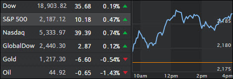
- Moving the Markets
Fed chief Yellen was in the spotlight during her congressional testimony at which time she pointed out that the election outcome has not changed the Fed’s plan for a rate increase “relatively soon” and absent any dramatic changes, a gradual pace of hikes thereafter. Sounds like the same rhetoric we’ve heard all year long.
Living costs have not only surged the most since 2007, but also increased at a faster rate than the Fed’s mandated 2%, which means a hike in rates would sure be justifiable based on this matrix. Especially energy and the overall cost increases associated with housing/shelter rose by 3.5% year over year, hardly a negligible number.
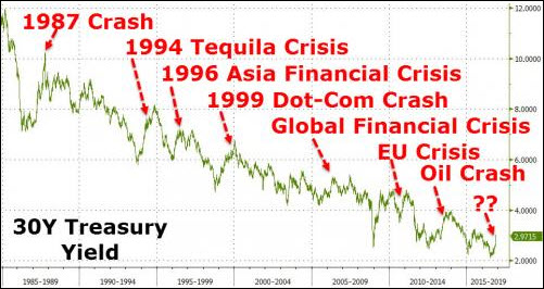
Bond yields spiked again and, as Horseman Capital pointed out sharp yield spikes have preceded every major crisis in the past 20 years. Here’s the chart they are referring to:

“The problem with sharply higher US bond yield is that this tightens financial conditions. We have often seen rises in yield coincide with financial market crises.
A rise in yields preceded the 1987 market crash. A rise in yield in 1994 preceded the Tequila crisis, when the Mexican peso devalued by half. After both events, yields quickly fell to new lows. Yields rose in 1996/7 before the Asian Financial Crisis, and yields again rose in 1999 before the dot com crash.
After both events, yields fell to new lows. More recently, bond yields rose in 2006 before the Global Financial Crisis, and again in 2010/1 before the Euro-crisis. There was also a rise in yields before the crash in oil prices in 2014. In all cases yields fells to new low.”
- ETFs in the Spotlight
In case you missed the announcement and description of this section, you can read it here again.
It features 10 broadly diversified ETFs from my HighVolume list as posted every Monday. Furthermore, they are screened for the lowest MaxDD% number meaning they have been showing better resistance to temporary sell offs than all others over the past year.
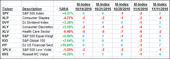
Here are the 10 candidates:

The above table simply demonstrates the magnitude with which some of the ETFs are fluctuating in regards to their positions above or below their respective individual trend lines (%M/A). A break below, represented by a negative number, shows weakness, while a break above, represented by a positive percentage, shows strength.
For hundreds of ETF choices, be sure to reference Thursday’s StatSheet.
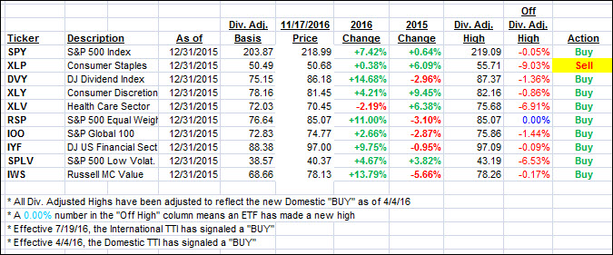
Year to date, here’s how the above candidates have fared so far:

Again, the first table above shows the position of the various ETFs in relation to their respective long term trend lines (%M/A), while the second one tracks their trailing sell stops in the “Off High” column. The “Action” column will signal a “Sell” once the -7.5% point has been taken out in the “Off High” column.
- Trend Tracking Indexes (TTIs)
Our Trend Tracking Indexes (TTIs) headed north as “slow and steady” was the theme of the day for the major indexes.
Here’s how we closed 11/17/2016:
Domestic TTI: +1.09% (last close +0.89%)—Buy signal effective 4/4/2016
International TTI: +2.20% (last close +1.96%)—Buy signal effective 7/19/2016
Disclosure: I am obliged to inform you that I, as well as my advisory clients, own some of the ETFs listed in the above table. Furthermore, they do not represent a specific investment recommendation for you, they merely show which ETFs from the universe I track are falling within the guidelines specified.
Contact Ulli